Dec 12, 2023
Dec 12, 2023
Dec 12, 2023
Dashboard Refresh
Dashboard Refresh
Dashboard Refresh
Today we’re excited to unveil a Refreshed Dashboard built to put your sites front and center.
Today we’re excited to unveil a Refreshed Dashboard built to put your sites front and center.
Today we’re excited to unveil a Refreshed Dashboard built to put your sites front and center.
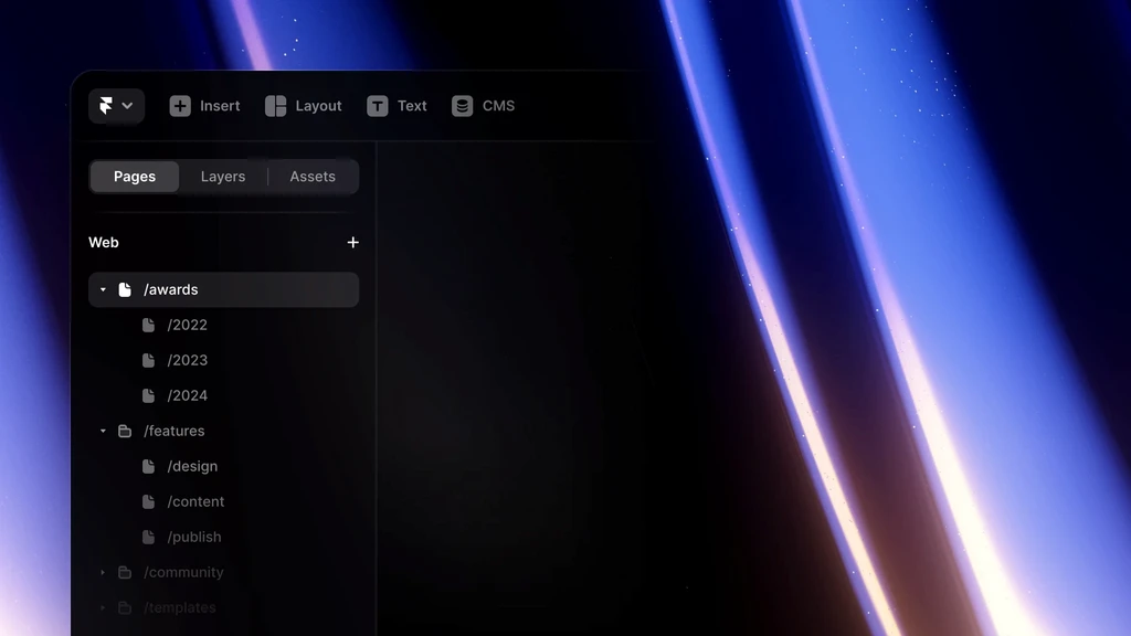
Today we’re excited to unveil a Refreshed Dashboard built to put your sites front and center. With this update, project thumbnails are now displayed in a much higher resolution, spanning the entire screen for a more comfortable browsing experience. Are your older project thumbnails showing blank? Read this guide explaining how to refresh them. As per your feedback, we have also added a badge indicating the current plan of each site. Additionally, we have relocated the Get Started section to the top of the sidebar while including convenient links to the Templates Gallery and the new Framer Academy. Furthermore, we have improved the search functionality and moved team recommendations to the bottom of the sidebar, allowing for more space dedicated to your project folders. These updates are just the beginning, as we have more exciting changes planned for Workspaces. Stay tuned!
Today we’re excited to unveil a Refreshed Dashboard built to put your sites front and center. With this update, project thumbnails are now displayed in a much higher resolution, spanning the entire screen for a more comfortable browsing experience. Are your older project thumbnails showing blank? Read this guide explaining how to refresh them. As per your feedback, we have also added a badge indicating the current plan of each site. Additionally, we have relocated the Get Started section to the top of the sidebar while including convenient links to the Templates Gallery and the new Framer Academy. Furthermore, we have improved the search functionality and moved team recommendations to the bottom of the sidebar, allowing for more space dedicated to your project folders. These updates are just the beginning, as we have more exciting changes planned for Workspaces. Stay tuned!
Today we’re excited to unveil a Refreshed Dashboard built to put your sites front and center. With this update, project thumbnails are now displayed in a much higher resolution, spanning the entire screen for a more comfortable browsing experience. Are your older project thumbnails showing blank? Read this guide explaining how to refresh them. As per your feedback, we have also added a badge indicating the current plan of each site. Additionally, we have relocated the Get Started section to the top of the sidebar while including convenient links to the Templates Gallery and the new Framer Academy. Furthermore, we have improved the search functionality and moved team recommendations to the bottom of the sidebar, allowing for more space dedicated to your project folders. These updates are just the beginning, as we have more exciting changes planned for Workspaces. Stay tuned!
More Updates
Jan 7, 2023
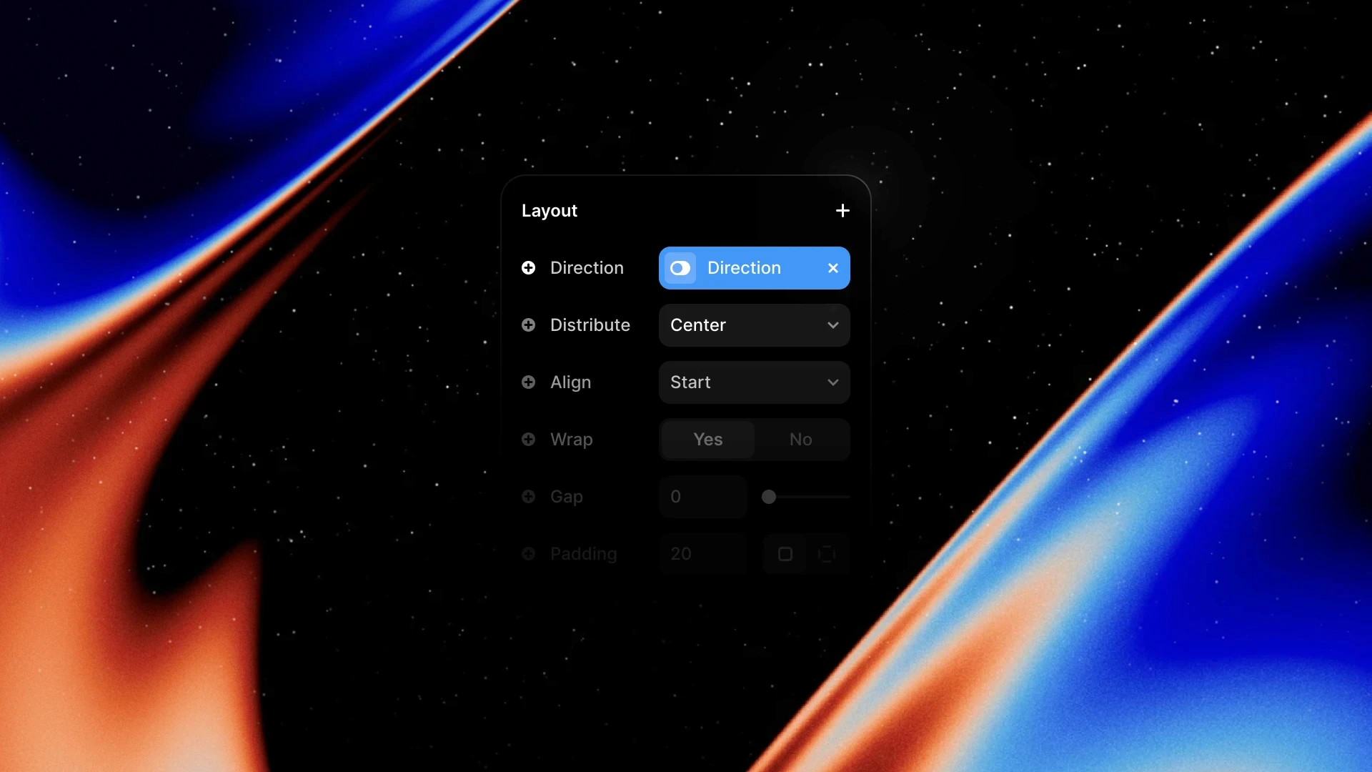
For things like Navigations, this means you have to rely less on Variants for responsiveness across Breakpoints, and can instead use Variables, allowing you to keep Variants for interactivity. An example of this can be seen in the video above. The addition of these Variables also enables you control layout via CMS Items, unlocking exciting new use cases.

For things like Navigations, this means you have to rely less on Variants for responsiveness across Breakpoints, and can instead use Variables, allowing you to keep Variants for interactivity. An example of this can be seen in the video above. The addition of these Variables also enables you control layout via CMS Items, unlocking exciting new use cases.
Jan 7, 2023

For things like Navigations, this means you have to rely less on Variants for responsiveness across Breakpoints, and can instead use Variables, allowing you to keep Variants for interactivity. An example of this can be seen in the video above. The addition of these Variables also enables you control layout via CMS Items, unlocking exciting new use cases.
Nov 9, 2023
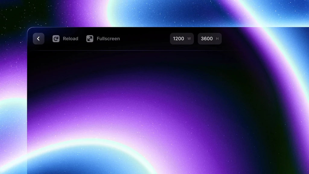
No more staring at loading spinners. Our previous Preview would have to load your entire project before it could start rendering your page, and then applied updates with your edits. The new Preview exclusively uses the same generated code as your published site, so it’s not only faster, but also more accurate. Plus, we’ve also tackled animation issues causing all transitions to stop working. We think you’ll love it, and would love to hear your thoughts in the Community.

No more staring at loading spinners. Our previous Preview would have to load your entire project before it could start rendering your page, and then applied updates with your edits. The new Preview exclusively uses the same generated code as your published site, so it’s not only faster, but also more accurate. Plus, we’ve also tackled animation issues causing all transitions to stop working. We think you’ll love it, and would love to hear your thoughts in the Community.
Nov 9, 2023

No more staring at loading spinners. Our previous Preview would have to load your entire project before it could start rendering your page, and then applied updates with your edits. The new Preview exclusively uses the same generated code as your published site, so it’s not only faster, but also more accurate. Plus, we’ve also tackled animation issues causing all transitions to stop working. We think you’ll love it, and would love to hear your thoughts in the Community.
Subscribe to Updates
Add your email below to receive an email for every newly launched feature we announce.


Subscribe to Updates
Add your email below to receive an email for every newly launched feature we announce.
Subscribe to Updates
Add your email below to receive an email for every newly launched feature we announce.
